

Problem Statement
The Challenge
Parents often struggle to find engaging yet educational stories that promote independence, problem-solving, and social-emotional development—core Montessori values. Existing platforms either focus too much on entertainment or rigid learning structures, lacking a balance between play and education.
Key Pain Points:
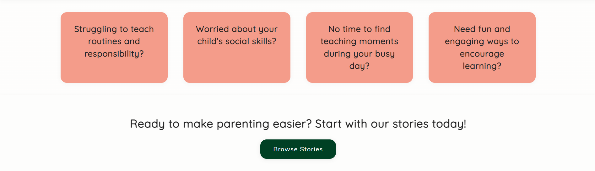
❌ Lack of interactive, practical Montessori storytelling resources
❌ Hard-to-find story-based life lessons for young children
❌ Poor user experience on existing children's book marketplaces
❌ Hard-to-find story-based life lessons for young children
❌ Poor user experience on existing children's book marketplaces
Research & User Insights
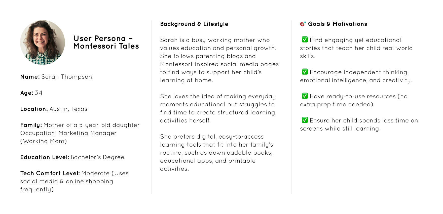
User Personas
🎯 Primary User: Parents of children aged 3–8
🎯 Secondary Users: Montessori educators, homeschooling parents
🎯 Secondary Users: Montessori educators, homeschooling parents
Key Findings
✔ Parents prioritize ease of access & simplicity → The site needed a clear, structured flow.
✔ Storytelling should reinforce Montessori principles → The design had to be calm, clean, and inviting.
✔ Users expect digital-friendly content → PDFs, audio versions, and printables needed to be seamlessly integrated.
✔ Storytelling should reinforce Montessori principles → The design had to be calm, clean, and inviting.
✔ Users expect digital-friendly content → PDFs, audio versions, and printables needed to be seamlessly integrated.

UX Strategy & Design Process
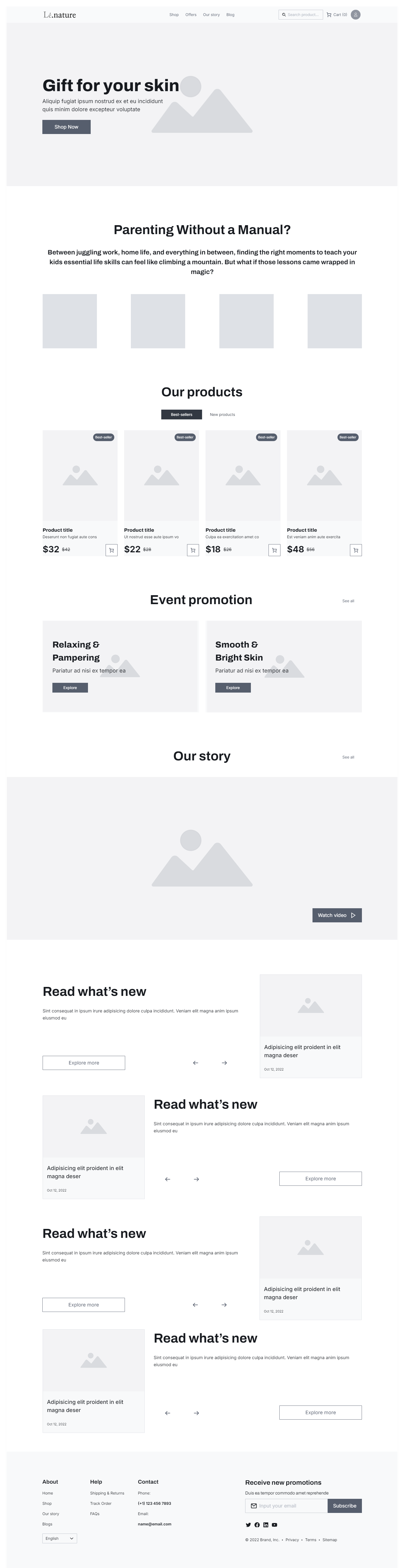
🛠 Wireframing & User Flow
A one-page storytelling funnel to engage, educate, and convert users smoothly.
Minimal distractions, focusing on discovering & purchasing stories.
Strategic CTAs placed after problem statements, reinforcing value before leading users to the store.
📌 Site Structure:
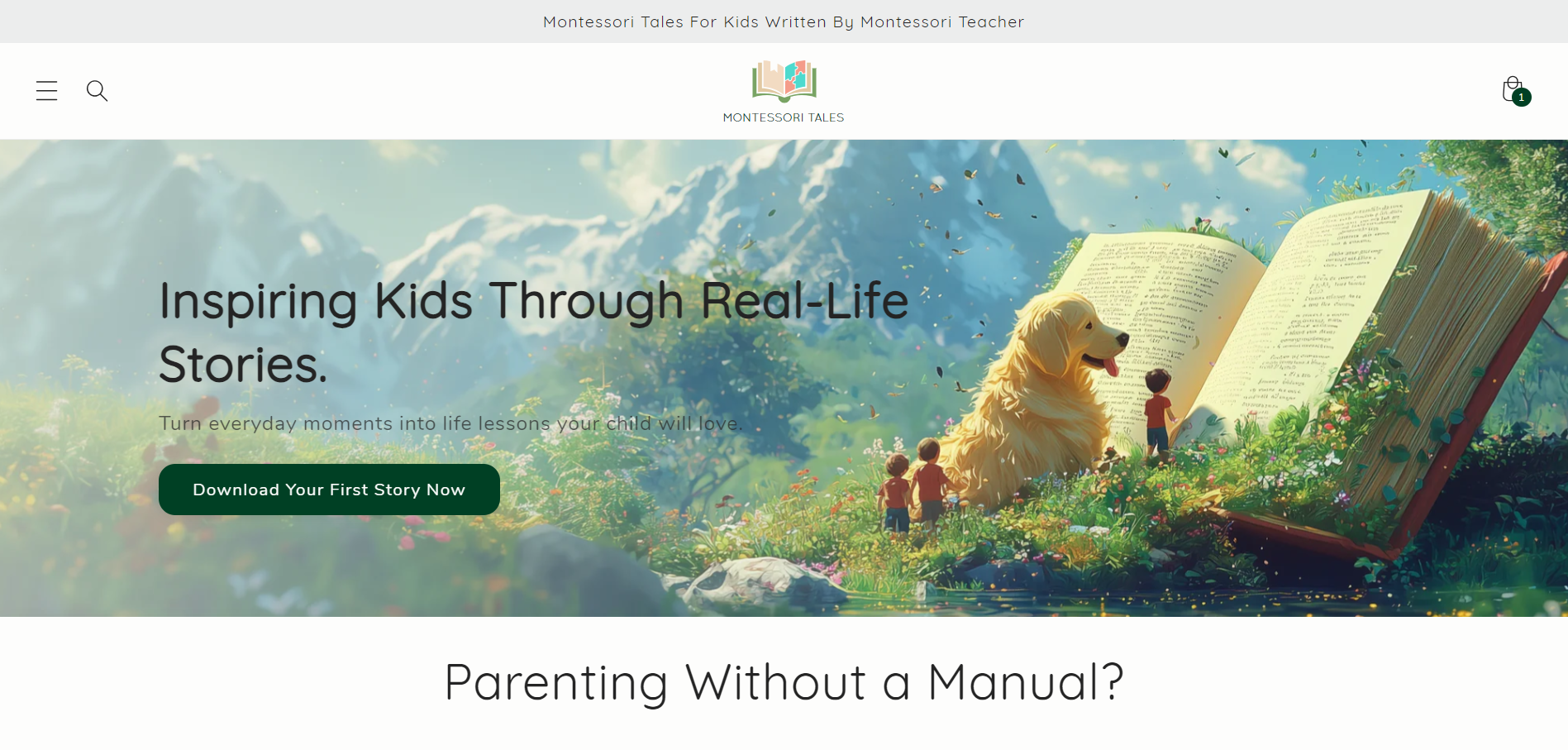
1. Hero Section – Engaging intro with a clear mission & CTA
2. Problem Recognition – Highlighting parent pain points in a relatable way
3. Who It’s For – Defining the audience & making an emotional connection
4. Why Montessori Tales? – Explaining the educational impact
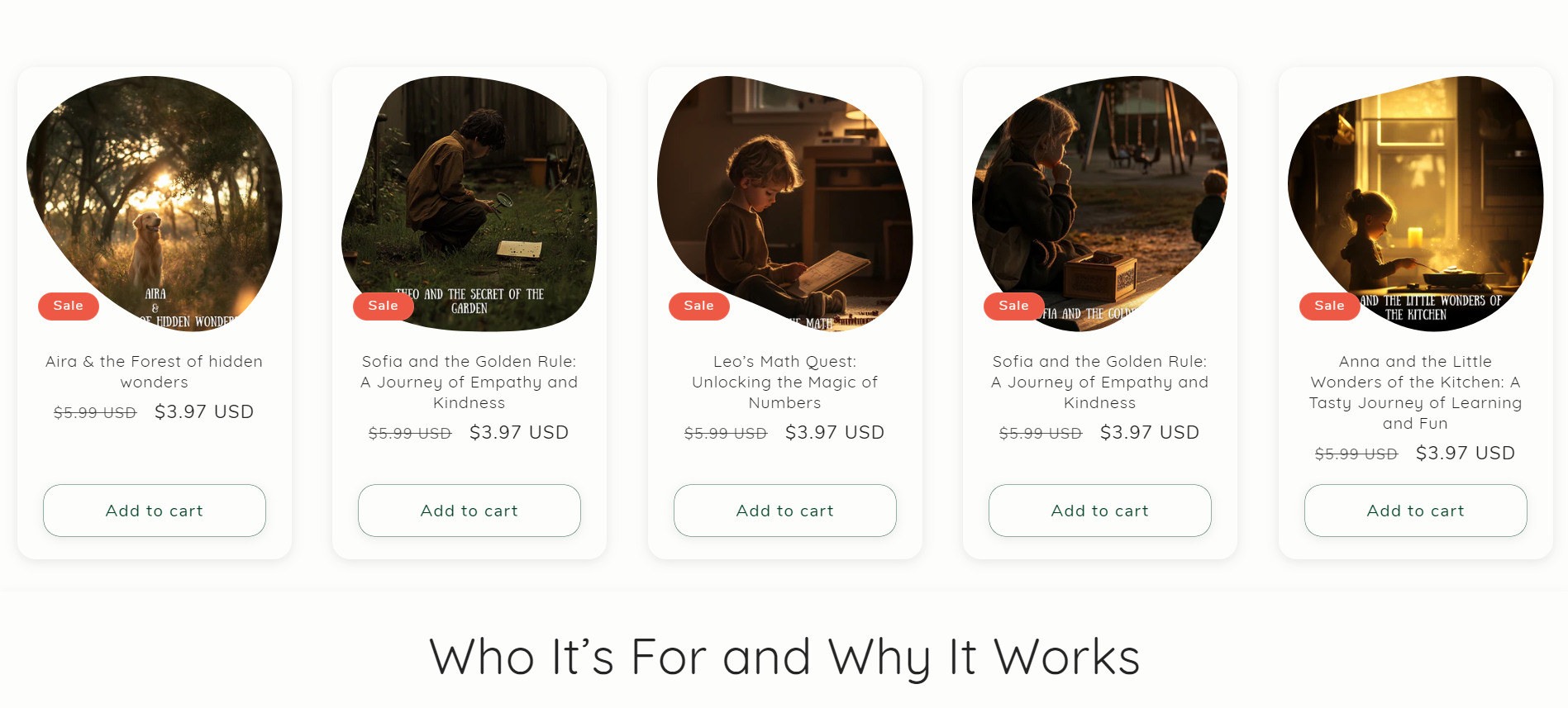
5. Featured Stories & Bestsellers – Encouraging quick browsing
6. Step-by-Step Guide – Explaining how Montessori Tales works
7. CTA (Start Your Journey) – Driving conversion
2. Problem Recognition – Highlighting parent pain points in a relatable way
3. Who It’s For – Defining the audience & making an emotional connection
4. Why Montessori Tales? – Explaining the educational impact
5. Featured Stories & Bestsellers – Encouraging quick browsing
6. Step-by-Step Guide – Explaining how Montessori Tales works
7. CTA (Start Your Journey) – Driving conversion
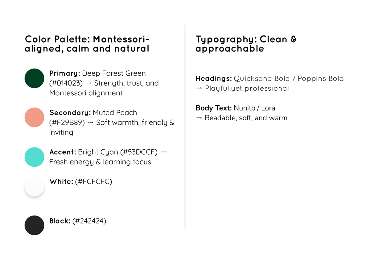
UI Design & Branding
🎨 Visual Identity
Usability Testing & Iterations
Key Usability Feedback & Improvements:
🔹 Issue: Some CTAs felt repetitive
➡ Solution: Adjusted copy variation for engagement-based micro-interactions.
➡ Solution: Adjusted copy variation for engagement-based micro-interactions.
🔹 Issue: Users wanted a clearer preview of stories before purchase
➡ Solution: Added sample story pages & short descriptions under each listing.
➡ Solution: Added sample story pages & short descriptions under each listing.
🔹 Issue: Initial design had too much color variation
➡ Solution: Refined to a more professional, clean layout with focused accents.
➡ Solution: Refined to a more professional, clean layout with focused accents.
Final Outcome & Impact
🚀 Launched a clean, Montessori-aligned digital storefront with a seamless user journey.
📈 Improved engagement with clear CTAs & structured storytelling flow.
🛍 Increased discoverability of stories through a simple & intuitive UI.
📈 Improved engagement with clear CTAs & structured storytelling flow.
🛍 Increased discoverability of stories through a simple & intuitive UI.
Learnings & Next Steps
What Worked Well?
✔ Montessori-driven UX decisions → Keeping the design clean, practical, and structured.
✔ Strategic CTA placements → Creating an effective storytelling-to-conversion flow.
✔ Balancing educational storytelling with e-commerce usability.
✔ Strategic CTA placements → Creating an effective storytelling-to-conversion flow.
✔ Balancing educational storytelling with e-commerce usability.
Future Improvements:
🔹 Introduce an interactive element (e.g., personalized story recommendations).
🔹 Enhance the blog section with parenting & Montessori tips.
🔹 Develop a subscription model for continued content access.
🔹 Enhance the blog section with parenting & Montessori tips.
🔹 Develop a subscription model for continued content access.
Conclusion
Montessori Tales successfully merges storytelling, UX/UI best practices, and Montessori principles into a thoughtfully designed experience. The platform is more than just a store—it’s a resource for parents looking to nurture real-world skills through engaging narratives.
📌 Key Takeaway:
A well-crafted UX/UI experience can turn a simple storytelling platform into a valuable educational tool that fosters independent learning.